Radiation Dose Chart by Xkcd
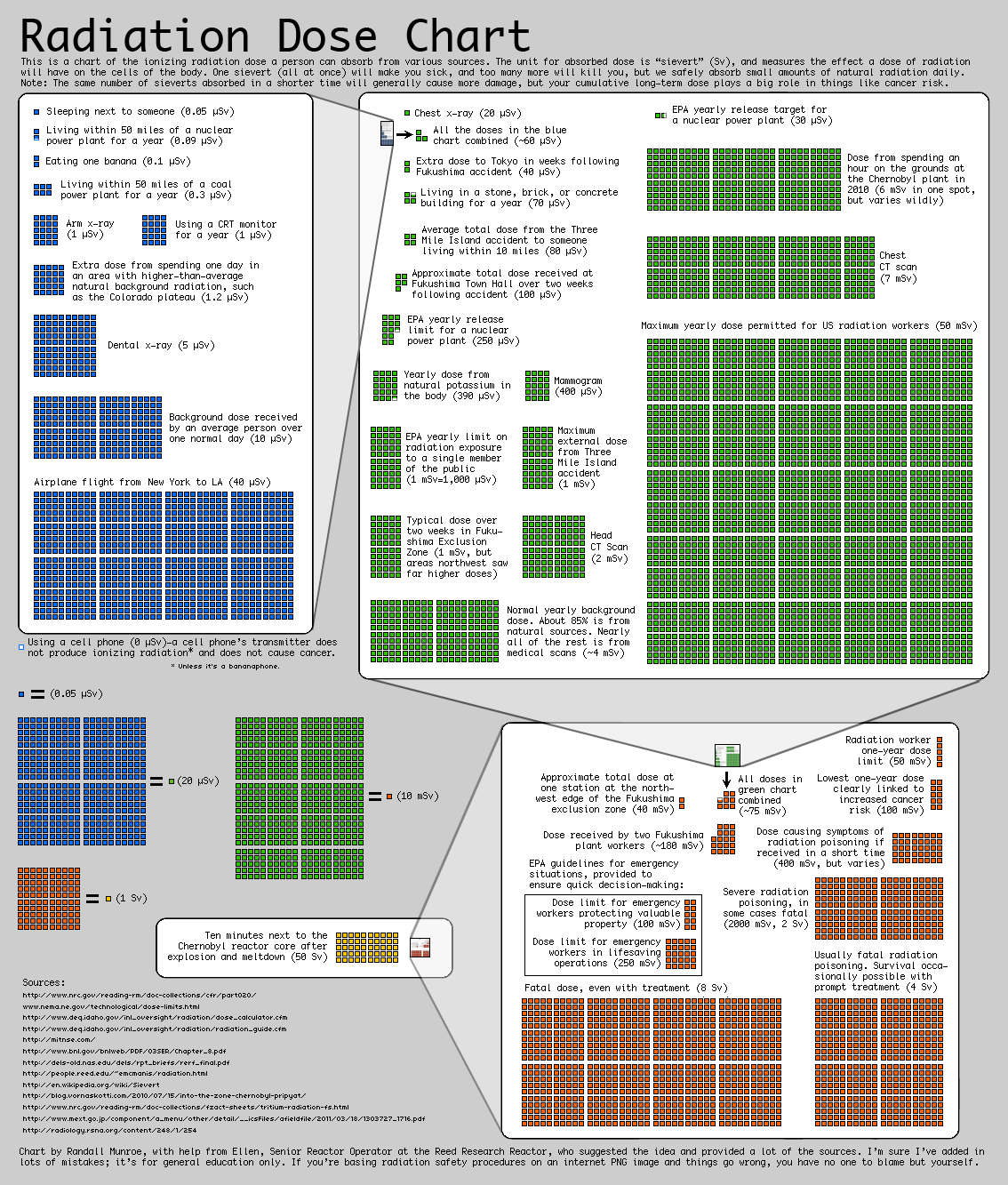
In response to concerns about the radioactivity released by the en:Fukushima Daiichi nuclear disaster:Fukushima Daiichi nuclear disaster in 2011, and to remedy what he described as "confusing" reporting on radiation levels in the media, Munroe created a chart of comparative radiation exposure levels. The chart was rapidly adopted by print and online journalists in several countries, including being linked to by online writers for The Guardian[1] and The New York Times.[2] As a result of requests for permission to reprint the chart and to translate it into Japanese, Munroe placed it in the public domain, but requested that his non-expert status should be clearly stated in any reprinting.[3]
- ↑ Monbiot, George (2011-03-21). "Why Fukushima made me stop worrying and love nuclear power". The Guardian.
- ↑ Revkin, Andrew (2011-03-23). "The 'Dread to Risk' Ratio on Radiation and other Discontents". Dot Earth blog. The New York Times.
- ↑ Munroe, Randall. Radiation Chart. xkcd.com.
From original page:

I waive all copyright to this chart and place it in the public domain, so you are free to reuse it anywhere with no permission necessary. (However, keep in mind that I am not a radiation expert, and this chart is intended for general public informational use only.)
Yderligere oplysninger om licens til billedet kan findes her. Sidste ændring: Sat, 10 Feb 2024 12:30:34 GMT